Ending 2020
It’s been a long year. I have been working in the studio although way too much time has been spent on the internet trying to make up for getting out and about in person. Thankfully, none of my immediate family has had Covid and for that I am thankful.
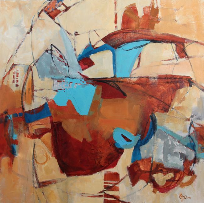
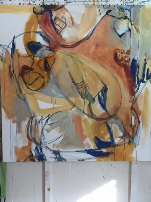
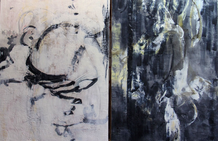
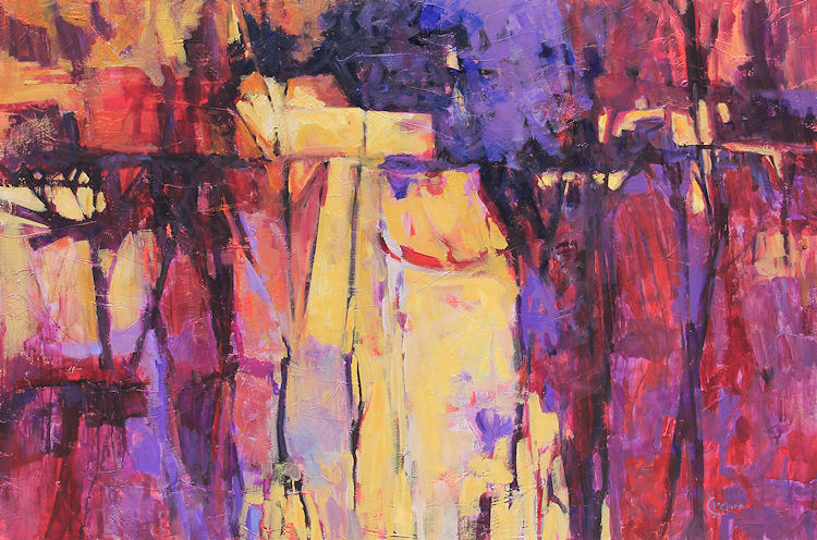
I was looking at this blog and saw that in February, I posted a couple of times on a large diptych. Both canvases are 40 x 40 inches.
Well, I just couldn’t let that diptych out into the world. It just didn’t feel like me. Sometime in late November, I gessoed over both of them and I have repainted one. This painting is now titled Just Add Turquoise.
I’ve already got a tone on the other one and I’m just waiting for the day to start. Hello, 2021 soon. I know it is going to be a great year. Thank you for reading my sporadic blog. I am grateful for every one of you.
Related Images:
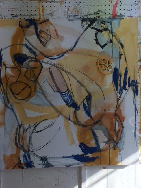
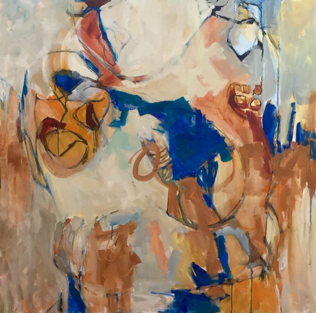
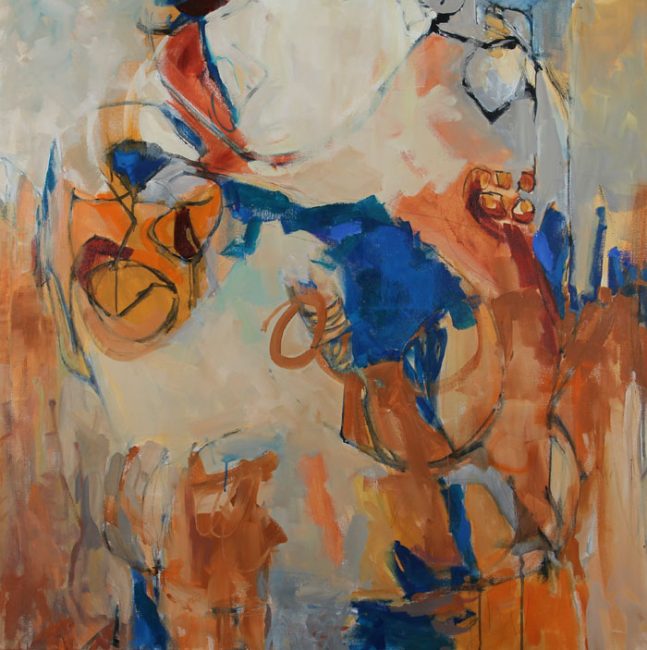
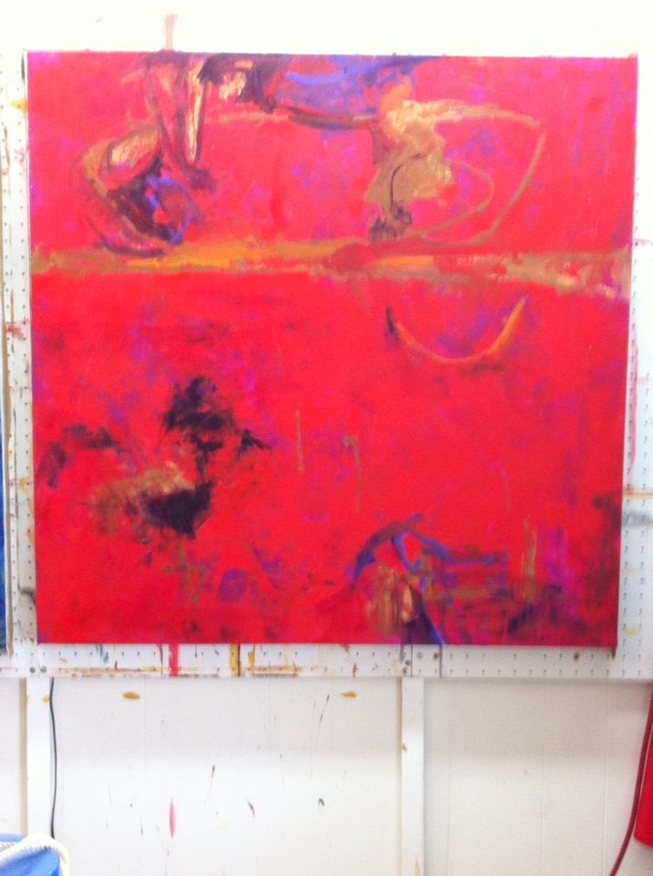
About that diptych
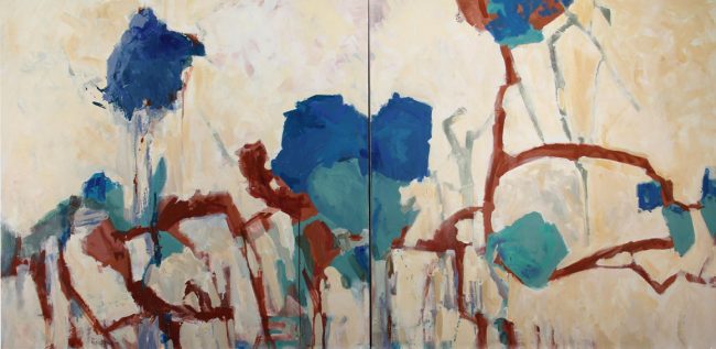
I have been slow to get back to you on how the two 40 x 40 inches canvases were progressing. All this last week I have had an earache, etc. BUT, finally I am through with this painting.
Whether or not it is successful or not is still to be determined. For the moment, it is finished and photographed. From the beginning I knew I set myself a challenge not having a tone on the canvas but I hate to become too dependent on something like that so now and then I leave it off.
What I like about this work is the rhythm set in the movement across the two canvases. I like the intervals between the shapes and the color is nice. It has been noted that I started with those large shapes in the middle. That doesn’t bother me as I think that other shapes balance this fine. It was my intent as time went on the make shpes with paler color to denote a degree of layering. I am still not sure if that succeeded but it is what it is.
If this is still in the studio on down the line, I can always paint over like I have done so many times in the past with other paintings. In the meantime, it will hang out in the studio with me taking a glance over at it now and then.
Related Images:
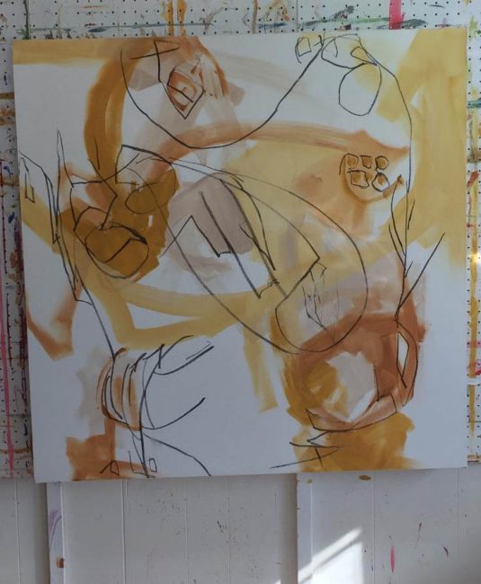
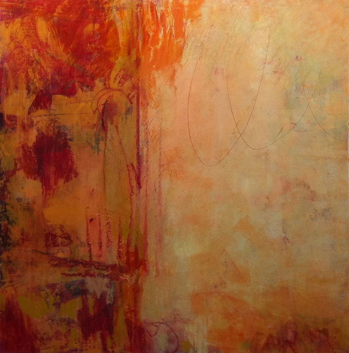
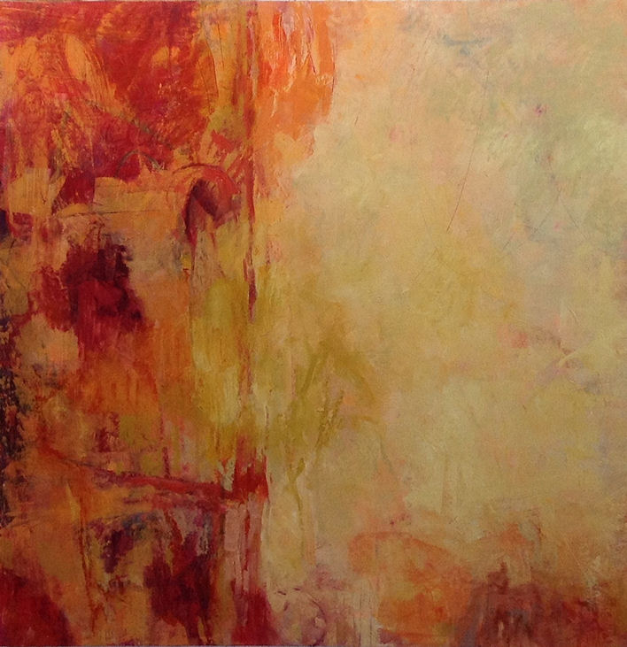
Reporting In on the two 40 x 40 canvases!
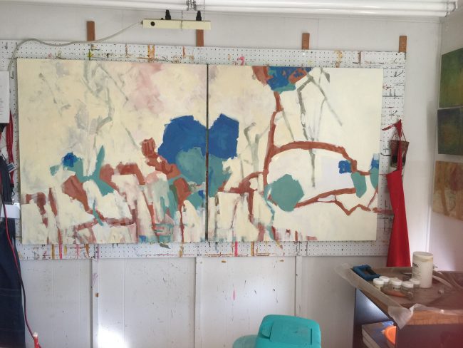
I have not reported in on that last painting start as you might have noticed if you read the last post. WHY, you ask??
Well, it is because nothing is working. I say nothing. On the first go round I liked that rhythm of the brush strokes. That is almost the only thing I liked if I want to be real.
I was challenging myself to do something different from what I usually do. But, what the heck!
This challenge is not working for me at all. First of all, I do not like using paint already mixed up without having a lot of other paint there to make some variation as I paint. I cannot really get what I want for edges if I do this “paint one color at a time stuff. EDGES are so important.
The colors could be okay. This is something I can say after mixing colors and jotting down what those mixtures contain. I don’t know that I love them, but I can change up if I need to.
I still like the rhythm of the beginning strokes of the painting. What I don’t like is the filling in of all that white space because I have found that having a color ground is a great way to unify a painting without worrying about little white flecks here and there. (But that was a part of the challenge to myself.)
SO, what am I going to do after fighting this all week?
I am going to attack it like I do all paintings that turned ugly. BUT that will be on Monday because I am going to see great art in Dallas with my daughter. We sign up for the CADD tours every couple of months and see a lot of great art at galleries and collections that we would would never have seen in galleries.
OKAY.. the ugly. If you don’t think it’s ugly but you have not seen it up close. Up close and surface is just as important at the distance view.
PLEASE, do let me know what you think. It might not make a bit a difference in what I do, but who knows?
Related Images:
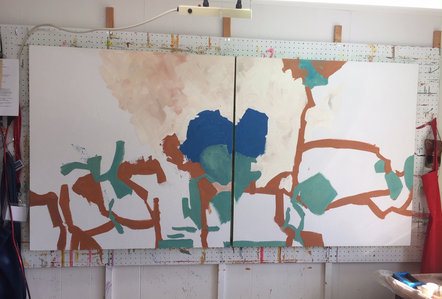
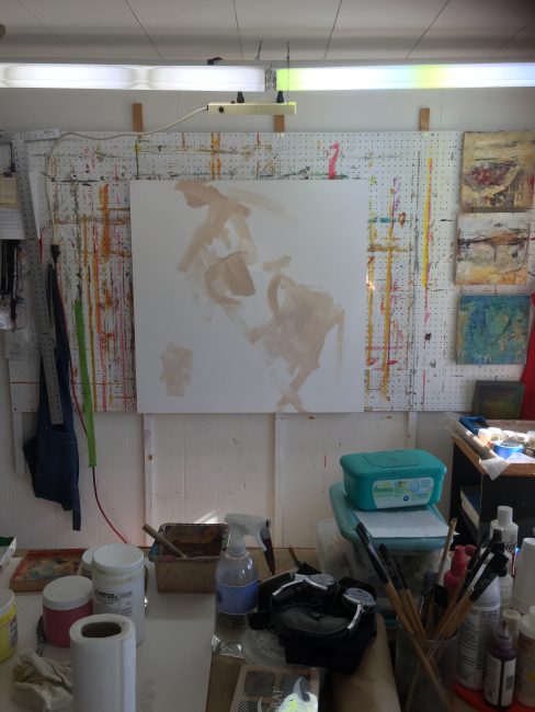
And so it begins!
I don’t know about you, but I get this urge now and then to just strike out and start work where I have no idea where it will go or how it will turn out.
You might say, I do this every time I paint, but that’s not really true. I do work intuitively but I still can’t help but have some idea because like everyone else, I can fall into a rut. I might even like the rut.
I’m trying to start a new painting(s) today with that idea in mind. And, of course, why not make it a real challenge by using fairly large canvases? These two are 40 x 40 inches each.
Saturday, when I was in the studio, I primed these two and set them out on my painting wall. I then, did something rare for me. I mixed up some smallish samples of paint to consider using on the two canvases. I jotted down the color mixtures without getting exact with it.
So then I came to the studio today and got out little dishes to mix the colors in. So far, I am not using my usual set up of a palette although I am sure that at some point I will because I just have to make variations of the colors and I can’t do that painting one mixture at a time.
And so, it begins. Stay tuned.
Related Images:
Welcome 2020… first painting of the year!
I am trying to think about what in the world people would want to know about my painting process and I’m coming up blank. That’s kind of the way I feel if I’ve been out of the studio for a while for whatever reason.
Maybe I should just ‘do it’ as the saying goes. That’s what I do while painting anyway. It is just paint, canvas, wood, paper and it’s not a catastrophe if it all goes south.
SO, this is how I started on a 40 x 40-inch canvas with acrylic early this week. Just a little mixture of unbleached titanium and nothing else that I remember. I am not toning the canvas or texturizing this canvas as I have done for so many years.
I just want to cover the canvas with paint, marks, and gestures. Then I will have to edit out what does not work.
Oh yes… I decided Between Seasons 3 would be a good title for this one.
Thanks for reading my blog. I feel so out of practice but I want to make the effort again for 2020.
If you have questions, please let me know. I love the interaction with others about my work.
Related Images:
Mounting oil on paper to wood panels
I’ve been working a lot on paper lately to conserve space in the studio. However, there comes a time when you have to decide if you are going to go to all the trouble and expense to use a frame, matt, and glazing or just more simply mount the work to wood panels This is that week.
Some people tell me they use acrylic gel medium but I have always found it easier to use a liquid gloss medium. First I make sure the whole board is covered with the medium, then I do the same for the back of the paper. This gives me more time to place the painting on the board. I, then smooth it all down gently from the center to the edges with a damp sponge and/or a soft brayer. I don’t press hard or the paper might stretch. I, also, am careful to wipe excess medium that will still seep out from between the paper and the panel.
Next, I place a sheet of glassine on the surface of the painting, lay a piece of cardboard or foam core over to help distribute the weight of all the books I pile on top. Then I wait twenty-four hours before removing.
Lastly, I trim the inevitable discrepancy of paper size to the panel size with a very sharp utility knife. Don’t do this until the paper/panel is bone dry or you will have a problem.
I haven’t decided yet what finish I will use for the edges. Usually, I just use a light wood stain. Sometimes, I even decide to go ahead and use a floater frame. At least I don’t have to cut a matt and use Plexiglas/glass.
The two oil paintings in the foreground are 20 x 20 inches and are titled, Finding My Way 1 and Finding My Way 2.
Related Images:
Completion of another Annotation series work… Veil
For two weeks, I have worked on this painting. It is oil so I have to wait (sometimes I am glad to wait, other times not), between the layers. It seems I am working with a lot of neutral colors lately. This kind of thing comes and goes in my work. It seems I have to make marks with any kind of color or implement, then cover them up. Then do this over and over until I embed the marks and colors into the surface. “It”.. the mark or color, needs to become a part of the surface. Not on top as an after thought but a part of the whole.
Like most artists, then I doubt myself and think..what was I thinking? And the next day I think I really do know what I am doing….HA, as if I will ever know what I am doing every step of the way. Whatever happens, I hope when the time comes, I will know when to stop.
In this painting, I can only hope that I have not veiled it so much that it becomes homogenized into a work that has no real impact.
I consider it a part of the Annotations Series I started last year.. with the sub-title of Veil.
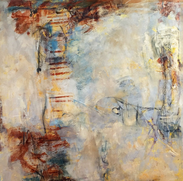
Annotation, Veil 40 x 40 inches, oil on canvas
Related Images:
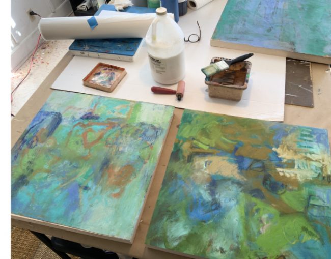
Finishing up two new encaustic paintings
Over the past couple of weeks, I have been sad that wasn’t going to the 9th International Encaustic Conference. I look forward to seeing like minded peeps at this professional conference every year.
To help make up for it, I started on two 40×30 inch wood panels with encaustic. I only set up parameters of using lot of black and white…one to be dominated by white and the other dominated by black.
I spent days between working quickly, alternating with the days of just staring at them. It’s not as easy to layer, block out and then re-do that layer as it is with some mediums. By that I meant there is more of a chance that each time you alter, you may never get back the freshness you had the first time. That said, rarely does the first time around end up being a good painting.
I now think I am through with both of these paintings that I am considering titling Reverie and Dark Reverie. I think the title of Dark Reverie fits better than the one for the light one so we will see later.
Reverie & Dark Reverie
both 40 x 30 x 2 inch encaustic on wood panels
Related Images:


Johnson Creek, February
I’ve been in the studio…. just not as much since the holiday rolled around and past. It seems like I have been spending too much time learning a new computer OS and all the new programs that come with that change-over to MAC. On the positive side, it is keeping my brain cells working over time.
I have been in that studio though and have been working with acrylic again since it has been awhile. This painting is 30 x 30 inches, acrylic on canvas, Johnson Creek, February.
Enjoy, I hope.
Related Images:
New Annotations series paintings
I have been working on a couple of oil paintings all month it seems. Oil takes a lot of consideration as well as drying time between layers. BUT, I think these two are both finished. They are both titled Annotations Series……..Annotations, Blue-Bay and Annotations, Red-Walk. They are both 36 x 36 x 2 inches on wood panels.
Related Images:
Longview Museum of Fine Arts
This time is almost here……………..the opening reception for the East Texas Regional Artists exhibit at the Longview Museum of Fine Arts, Longview TX.
I am honored to have been chosen for this six artist showing for 2014. Saturday, July 19, 2014 215 E. Tyler St., Longview, TX 7-9pm
Related Images:
Slow Progress is sometimes the best of all.
When I paint, it is usually with a large flurry of paint, gesture, mark-making. It doesn’t matter sometimes what comes first so it is okay to just let loose with acrylic
Then there are those other times when you have to slow down………..and that is not a bad thing. Oil painting is one such process. I have to slow down, look more, think more.
That has been the case with the last two paintings I started on at the same time. One is still waiting for more judgement. This one is progressing to the point I can show it. It may not be totally finished. Sometimes there is a little more finesse needed in the paint surface, or a dark or a line to be made that I will discover a little later. I have even turned it all around………it could be hung in about any direction, especially since it is a square.
The final title will be determined when I am sure, but it is another painting in my Annotation Series begun earlier this year.
Here are the three stages I photographed as time went past.
1st stages
2nd stages, 36 x 36 oil on wood panel
3rd and maybe final image, 36 x 36 oil on wood panel
Related Images:


Recent Comments